Why Good Design Is Essential To Your Business
Everyone knows that things that look nice obviously get more attention. Good design is pretty much the same thing. Without a well designed logo, business card or brochure, your business could go completely unnoticed when compared to a competitor. Why does good design matter so much? If all of your business’ information is there – as long as it’s clear to read, isn’t that really all tha matters?
Yes and no.
Good design is more than just readability and clarity of message. Good design, when done right, can transform a business’ logo into a brand; a brand that is consistent, professional and attracts customers to you. Sure, readability and a clear message is important, however, just as important is the presentation of the message. For instance, you wouldn’t use the same design to attract children to your business as you would senior citizens, would you? Of course, you wouldn’t. In this respect, you need to consider your design.
How will you know what good design is?
Unlike most things nowadays, you don’t need a sledge hammer to get your message across to your target audience when it only requires a tack hammer. Unless your in the demolition business – in which case, feel free to use the sledge. Good design is usually something you can determine pretty quickly when you’re looking at it – do you feel comfortable reading the message? Or are you agitated? Does it make you want to buy something? Do something? Or does the message get lost in the design? Is it using the sledge hammer or the tack hammer?
You may not have an eye for design – few people who aren’t designers do. However, there are some basic components that make up a good design that are pretty universal. Not every component will be used on every piece, however, each component is important to its relevant design.
Basic Components of Good Design
1. A Compelling Headline
The first basic component of any good design is a compelling headline. On any kind of ad, poster, or marketing piece, there’s always some type of headline whose purpose is to grab the reader’s attention. Often times, the headline will be “Enter to Win” (as seen below) or “More Than Just Great Design” (as seen on our home page). Some headlines can be what are commonly referred to as “click bait” – text that is just too irresistable for people to pass up. Ultimately, that’s the goal – getting someone to click, call or do something to learn more.
“Enter to Win!” is an extremely compelling headling that prompts the reader to action immediately.
“More Than Just Great Design” is a great headline that requires the reader to fine out more about the headline.
Why It’s Important: If you’ve got a lot of content – text, images and graphics – things can get pretty wild without a headline to keep things orderly. A headline gives the design a theme and should be at the top of your design piece’s hierarchy. Headlines instantly grab your reader and let them know what the text below is about.
2. A Clear Message
The second component to a good design is to have a clear, concise message. It use to be that you had 8 seconds to get someone’s attention before you lost their attention. Now, that’s like 4 or 5. Possibly even 3. Just as the headline needs to be compelling, the message needs to be clear – what is it that you want people to do? Click? Call? Write? Make it inexplicably clear what you want them to do AND what you’ll do for them.
As an aside, make sure your message has more to do with benefits to your reader and less about what you offer. Remember benefits not features. Keep your message conversational – remember that you’re trying to invoke a response from them to act – be clear, concise and focus on your reader. For more on this, read our post on writing engaging content.
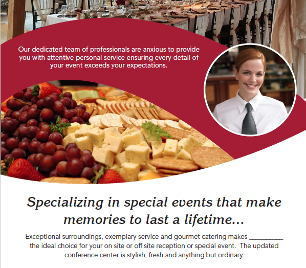
The message (including headline) is clear on this mockup example above for a catering service.
Why It’s Important: When you have a clear message, there’s clear action. When a message is unclear or ambiguous, there may be no action OR the message may be missed entirely. By keeping your messages clear but concise, you ensure that the message doesn’t get lost among the rest of your piece’s assets.
3. An Attractive Color Scheme
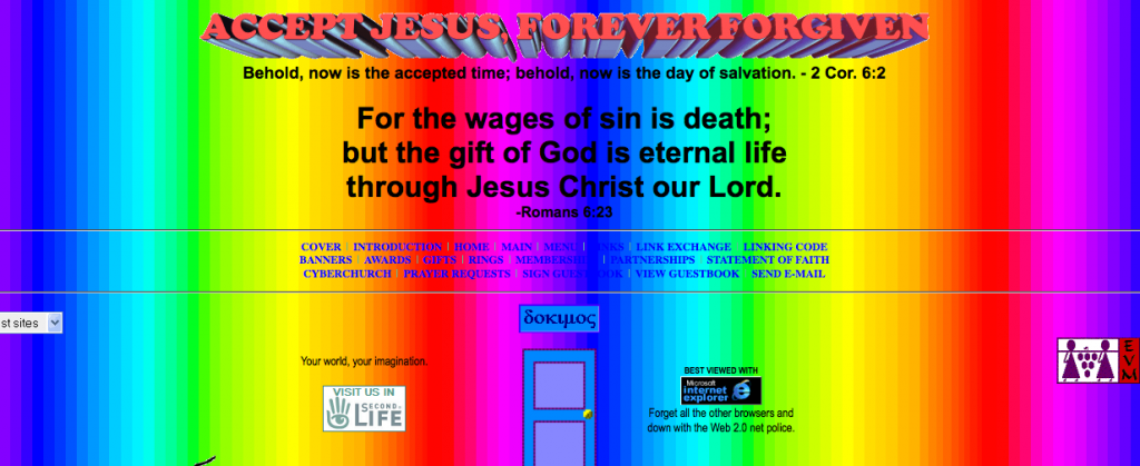
We’ve all seen designs where it looks like a rainbow exploded all over the page. This is the kind of thing you want to avoid. It’s important to have a color scheme – colors that work together naturally, that aren’t forced and are overall pleasant to look at. You might be saying to yourself, “I have no idea how to build a pleasing color scheme!” There are times that I just don’t either. So, as luck would have it, there are some awesome online tools that help do just that – generate color schemes. Coolors is a great tool for generating color schemes. Adobe has a color scheme generator as well. Another great color scheme generator is called Palletton which essentially works much the same way a painter’s palette would.
This is a color scheme abomination and should be stricken from existence.
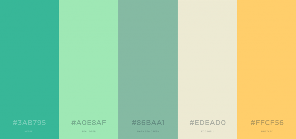 This is an example of a color scheme generated by Coolors.co
Why It’s Important: Having a color scheme just makes your design look like everything belongs together. The wrong colors, when put together, can make a design difficult to look at or unreadable. If you’re already having issues with headlines and messages, having color scheme issues could seal the fate of your design for good.
4. A Sensible Composition
Even if you have a kick ass headline, an uber clear message and cohesive color scheme, it won’t mean a thing if you don’t have a good composition. Composition is kind of like a puzzle: when all the pieces of the puzzle, in this case your headline, message, colors, etc. are put together, the form a composition. The composition of a good design should lead your eye throughout a piece – it should be designed in such a way that your eye should start with the headline and work your way through the design until it exits the design at the bottom, or after all fo the content has been consumed.
A variety of methods could be used to contribute to the direction your eye takes through a composition, such as design elements that lead your eye to key information which then directs your eye to a supporting image and then to more content. Use overlapping of elements to give the illusion of depth to create an even greater sense of direction in your design. Use colors to help draw attention to important information, or in some cases, to take the eye away from certain content.
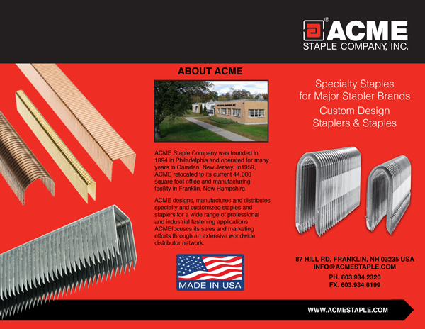
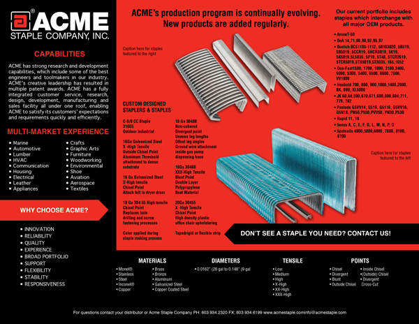
The Acme Staple brochure above was a challenge creating a good composition with minimal graphical elements. As you can see, even without a lot of graphics and images, you can make even staples attractive.
Composition isn’t easy. What is easy to see is when something isn’t composed well. The general feeling after looking at a piece that isnt’ composed well is “meh.” Composition is key to all the other elements working together.
Why It’s Important: Composition determines whether all of your information gets read – or not. As stated above, your lead in to your design should be your headline and the composition of the piece should lead the reader’s eye throughout the piece in such a way that all the information gets consumed. Without a composition that does this, your design will inevitably fail in its purpose.
Beyond these four basic components, there are some “supporting” components, or assets, that help make up a good design. Some of these include stock photography OR even better actual photography taken by you or your business, quality vector graphics, charts, graphs and supporting text. A good rule of thumb is not to use clipart unless absolutely necessary and even then, only under duress.
Why no clipart? Clipart screams unprofessionalism. What’s the difference between clipart and quality vector graphics? Well, for instance, clipart tends to be low resolution. It tends to be super basic and often doesn’t match the tone of your piece. Given the amount of resources out there (iStock, Shutterstock, 123rf) you can inevitably find a quality vector graphic that will match the tone of your design AND your color scheme.
I hope now you can see why good design is essential to your business. I hope some of the resources I’ve given are useful to you, as I know I use many of them myself.
Do you have any tools that help you with design? Did I miss any essentials to good design? Let me know what you think!


